Midwest Ceramic Coating
About This Project
Custom WordPress brochure website developed for Midwest Ceramic Coating, a ceramic coating business. The project focused on creating a modern, responsive marketing website with a custom WordPress theme, reusable Gutenberg blocks, interactive page elements, and a streamlined content editing experience.

Project Page Gallery
A visual walkthrough of the custom page layouts, service pages, before-and-after photography, reusable Gutenberg blocks, and responsive website components developed for Midwest Ceramic Coating.
Site Exploration
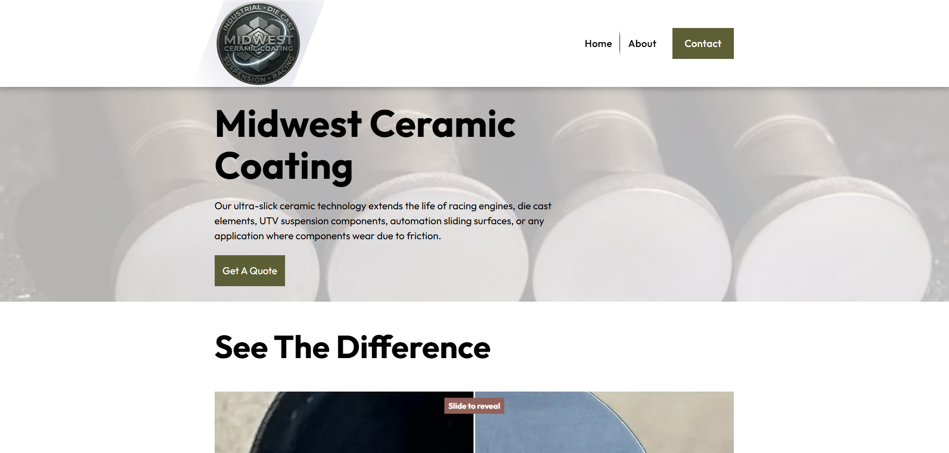
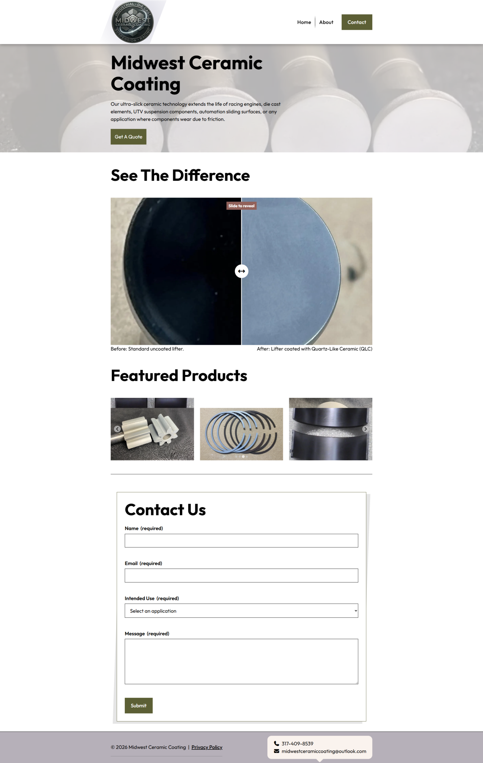
Home
Introduces the business and establishes the visual identity.
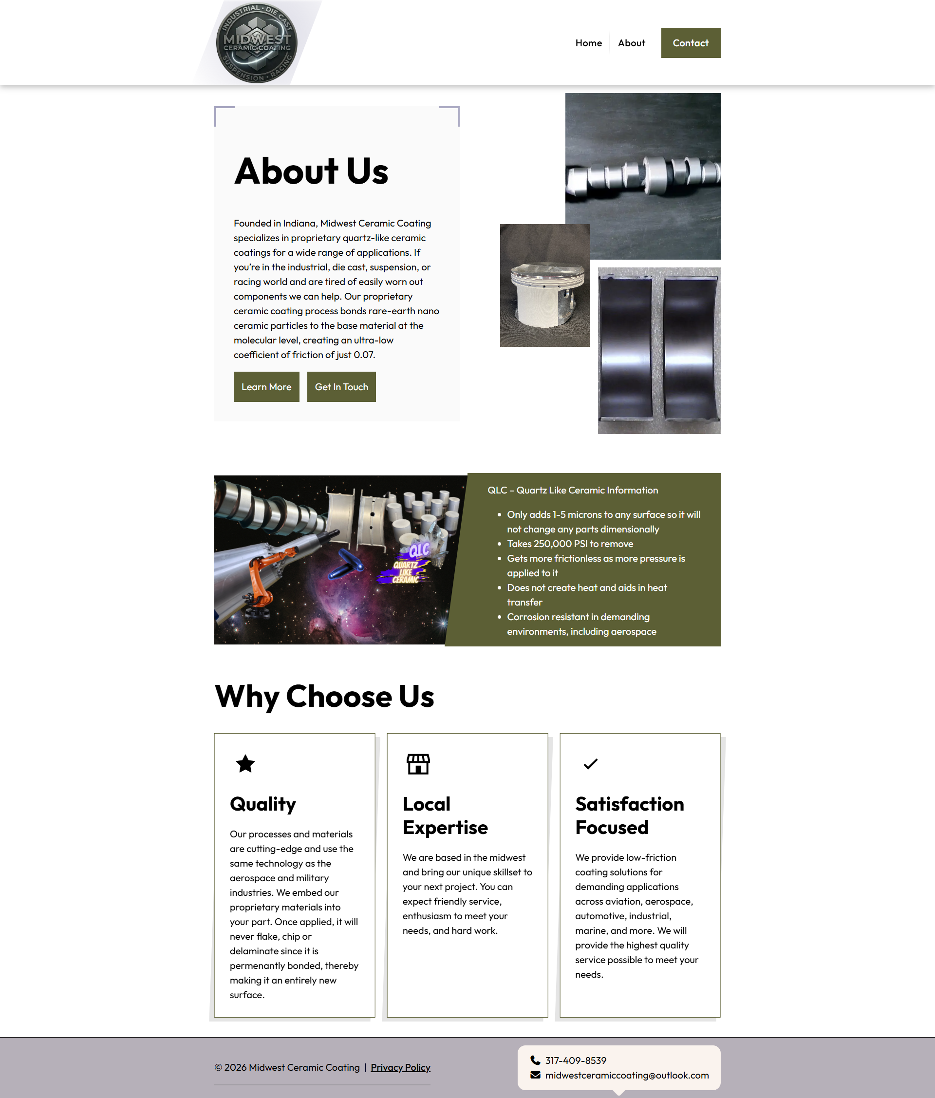
About
This is a company storytelling page that highlight’s Midwest Ceramic Coating’s services and expertise.
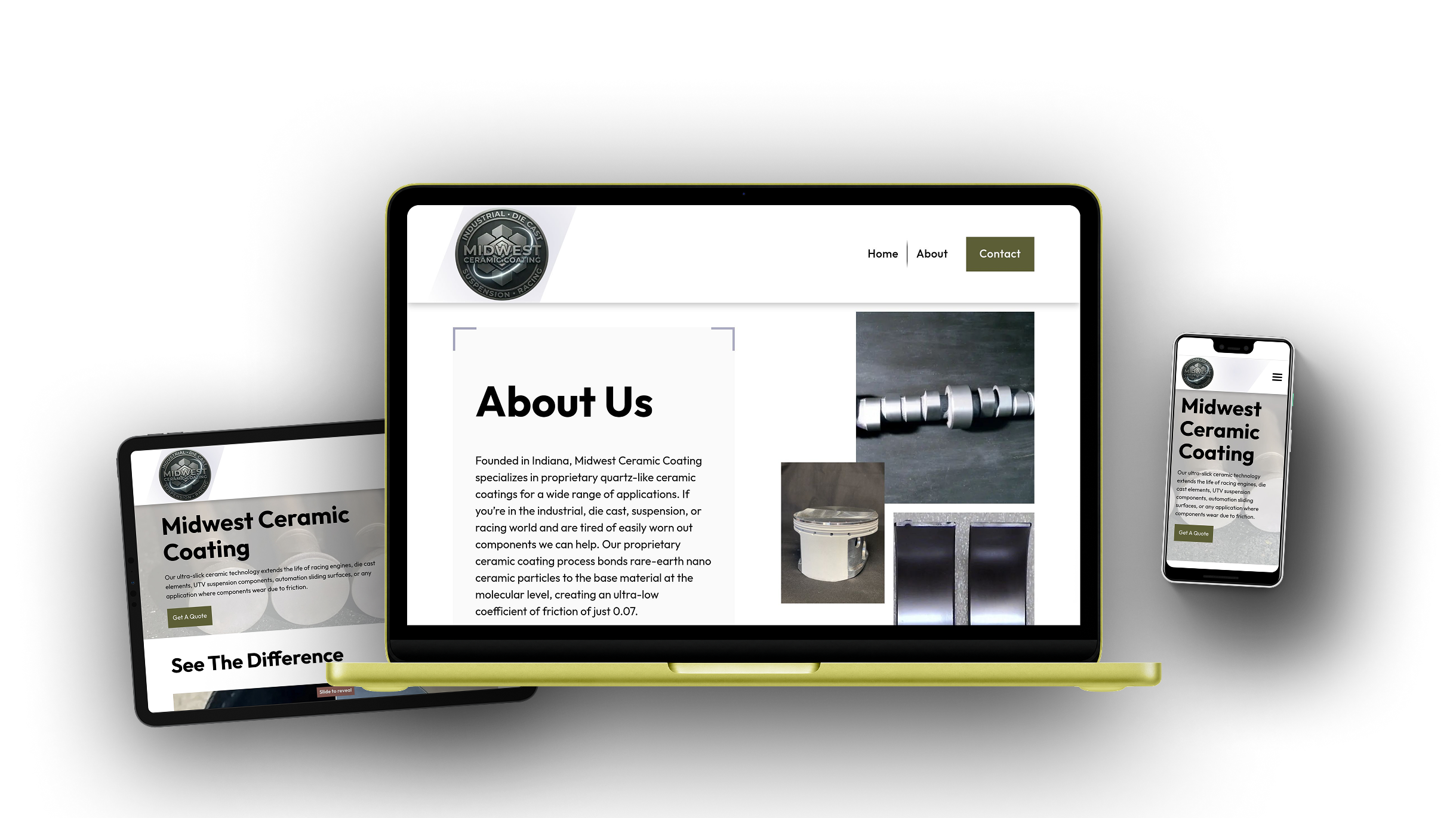
Responsive Design
The custom WordPress theme was developed with a responsive, mobile-first approach, ensuring layouts, imagery, and interactive components adapt seamlessly across desktop, tablet, and mobile devices.
Color Scheme
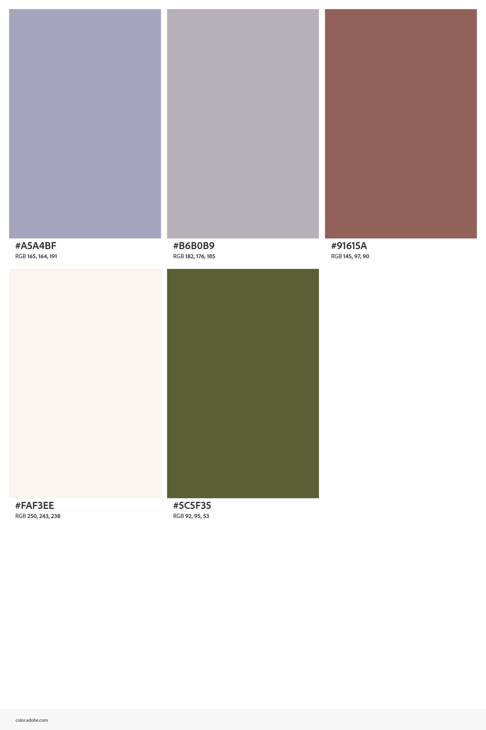
I had a lot of fun coming up with the color scheme for the website and settled on using mostly white and light colors. Green, blue, and brown accents were used too.
Theme Architecture
The Midwest Ceramic Coating website was developed as a fully custom classic WordPress theme rather than being assembled with a page builder. Its architecture combines PHP templates, reusable Gutenberg blocks, modular Sass, and bundled JavaScript to provide a maintainable foundation for both visitors and future content editors.
Dart Sass is used to organize and compile the theme’s stylesheets, while esbuild bundles the JavaScript used by the navigation, image galleries, animations, and interactive content. WordPress editor styles help keep the editing experience visually consistent with the frontend website.
WordPress Development
The theme uses native WordPress APIs for theme setup, asset loading, navigation, editor styling, custom fields, and content rendering. The expandable examples below highlight selected portions of the implementation without displaying the complete project source code.
Theme Support and Navigation
Theme capabilities and editable menu locations are registered during WordPress initialization. This enables native support for document titles, featured images, custom logos, editor styles, and managed navigation menus.
View source PHP
add_theme_support( 'title-tag' );

add_theme_support( 'post-thumbnails' );
add_theme_support( 'custom-logo' );
add_theme_support( 'editor-styles' );

register_nav_menus( [
'primary' => __( 'Primary Menu', 'midwest-ceramic-coating' ),
] );
Resilient Asset Loading
Stylesheets and scripts are loaded through the WordPress enqueue system. File modification timestamps are used for cache busting so visitors receive updated compiled assets after a deployment.
View source PHP
wp_enqueue_style(
'mwcc-style',
get_theme_file_uri( '/build/css/style.min.css' ),
[],
filemtime(
    get_theme_file_path( '/build/css/style.min.css' )
)

);
Editor Styling
A dedicated editor stylesheet brings the appearance of Gutenberg content closer to the frontend design, helping editors understand how their content will look before publishing.
View source PHP
add_theme_support( 'editor-styles' );

add_editor_style(
'build/css/editor.min.css'
);
Centralized Site Settings
Reusable business information is stored as custom fields on a dedicated Site Settings page. Theme templates retrieve the saved values from one location rather than repeating contact information throughout the site.
View source PHP
$settings = get_page_by_path( 'site-settings' );

$email = $settings
? get_field( 'email', $settings->ID )
: '';
Accessible Theme Templates
The templates use WordPress functions for document attributes, body classes, generated page assets, and navigation output. A skip link also allows keyboard users to move directly to the primary page content.
View source PHP
<html <?php language_attributes(); ?>>

<body <?php body_class(); ?>>

<a class="skip-link" href="#main">
<?php esc_html_e(
'Skip to content',
'midwest-ceramic-coating'
); ?>
</a>
Extending Core Blocks
Custom visual styles extend native Gutenberg blocks so editors can apply branded layouts without requiring a new custom block for every design variation.
View source PHP
register_block_style(
'core/media-text',
[
    'name'  => 'angled-feature',
    'label' => __(
        'Angled Feature',
        'midwest-ceramic-coating'
    ),
]

);
Custom Gutenberg Blocks
Reusable Gutenberg blocks were developed as self-contained components with structured attributes, native editor controls, and PHP render templates. This allows specialized page layouts to be managed directly inside WordPress while keeping the frontend markup under the theme’s control.
Metadata-Based Registration
Each custom block is described through a block.json file and registered from its metadata. This keeps attributes, editor assets, styles, and rendering behavior organized within the block’s directory.
View source PHP
register_block_type_from_metadata(
get_stylesheet_directory()
    . '/blocks/reveal'

);
WordPress Media Library
Image-based blocks integrate with the native WordPress Media Library. Editors can select or replace images without entering file URLs, while attachment details are stored as structured block attributes.
View source JavaScript
onSelect: ( media ) => {
setAttributes( {
    imageId: media.id,
    imageUrl: media.url,
    imageAlt: media.alt || ''
} );

}
Native Content Controls
Editable headings and descriptions use Gutenberg’s native content components. Available formatting is intentionally limited to preserve the design while still allowing editors to add emphasis and links.
View source JavaScript
el( RichText, {
value: attributes.description,
allowedFormats: [
    'core/bold',
    'core/italic',
    'core/link'
],
onChange: ( description ) =>
    setAttributes( { description } )

} );
Secure Server-Side Rendering
Dynamic blocks are rendered through PHP templates. Text, URLs, and HTML attributes are escaped according to their output context before being displayed on the frontend.
View source PHP
<h2>
    <?php echo esc_html( $heading ); ?>
</h2>

<img
    src="<?php echo esc_url( $image_url ); ?>"
    alt="<?php echo esc_attr( $image_alt ); ?>"
>
Before & After Reveal Block
A custom Before & After block was developed specifically for ceramic coating photography. Visitors can drag the comparison control to reveal the finished vehicle while editors manage both images and descriptions within Gutenberg.
View source JavaScript
function updateReveal(value) {
  value = Number(value);

  $after.css(
    "clip-path",
    "inset(0 " + (100 - value) + "% 0 0)"
  );

  $handle.css("left", value + "%");
  $hint.css("left", value + "%");

  $block.toggleClass(
    "is-all-before",
    value <= 5
  );

  $block.toggleClass(
    "is-all-after",
    value >= 95
  );
}

if (
  !$range.length ||
  !$after.length ||
  !$handle.length
) {
  return;
}

$range.on("input change", function () {
  updateReveal($(this).val());
});

updateReveal($range.val() || 50);
Progressive Enhancement
Gallery content is rendered by WordPress before JavaScript runs. Supported browsers receive an enhanced slider and lightbox experience, while a static image layout remains available as a fallback.
View source PHP
<noscript>
<div class="gallery__fallback">
    <?php foreach ( $images as $image ) : ?>
        <img src="<?php
            echo esc_url( $image['url'] );
        ?>" alt="">
    <?php endforeach; ?>
</div>

</noscript>
Interactive Frontend Features
The frontend combines custom JavaScript behavior with focused third-party libraries to support responsive navigation, subtle animation, fullscreen image viewing, and touch-friendly galleries. These enhancements are kept separate from the core WordPress content so the underlying pages remain structured and maintainable.
Responsive Navigation
The custom navigation supports sticky positioning, multi-level dropdowns, responsive mobile controls, and updated accessibility attributes when the menu opens or closes.
View source JavaScript
$toggle.on( 'click', function () {
$navigation.toggleClass( 'is-open' );

$( this ).attr(
    'aria-expanded',
    $navigation.hasClass( 'is-open' )
);

} );
Scroll Animations
Subtle entrance animations help guide visitors through service content without overwhelming the layout. Animations run once and use consistent timing throughout the website.
View source JavaScript
AOS.init( {
duration: 700,
easing: 'ease-out',
once: true,
offset: 80

} );
Touch-Friendly Galleries
Splide.js powers responsive image galleries that support touch gestures, keyboard navigation, configurable slide counts, and mobile-friendly browsing.
View source JavaScript
// Product slider
$(".product-galleryblock__slider").each(function () {
    new Splide(this, {
        type: "loop",
        perPage: 3,
        gap: "1.5rem",
        autoplay: true,
        interval: 3500,
        pauseOnHover: true,
        pauseOnFocus: true,
        arrows: true,
        pagination: true,
        breakpoints: {
            768: {
                perPage: 1
            }
        }
    }).mount();
});

$(".product-galleryblock__lightbox").on("click", function () {
    $(this).blur();
});
Fullscreen Image Viewing
GLightbox provides fullscreen viewing for completed projects and service photography, allowing visitors to inspect larger images without leaving the current page.
View source JavaScript
GLightbox( {
selector: '.glightbox',
touchNavigation: true,
loop: true

} );