TLK Precision
About This Project
I’ve had the opportunity to work on a website for TLK Precision, a business that has shared owners with Flex Rock UTV Performance. The following updates were made after the initial build (created by someone else) to improve both functionality and aesthetics.
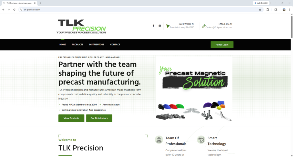
Home Page Enhancements
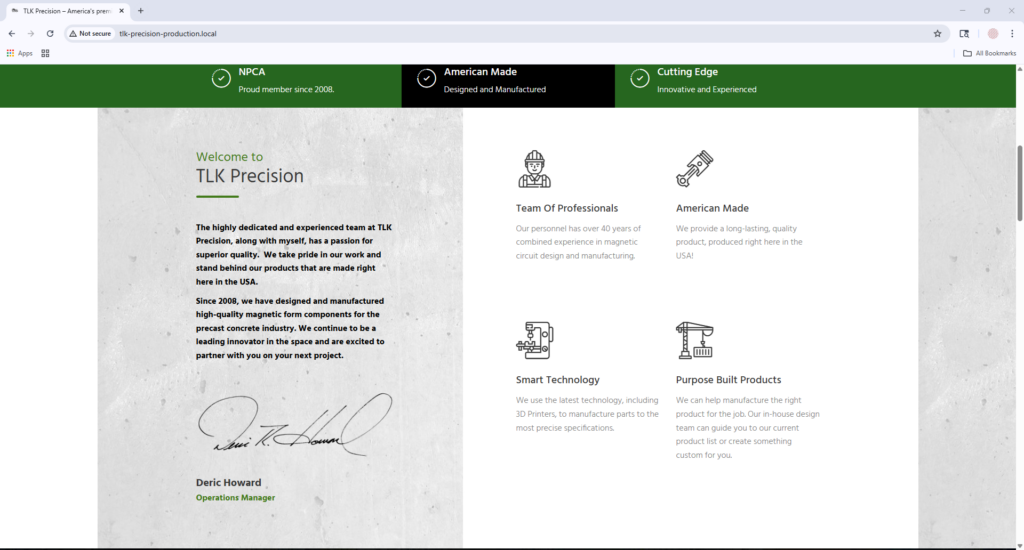
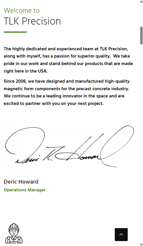
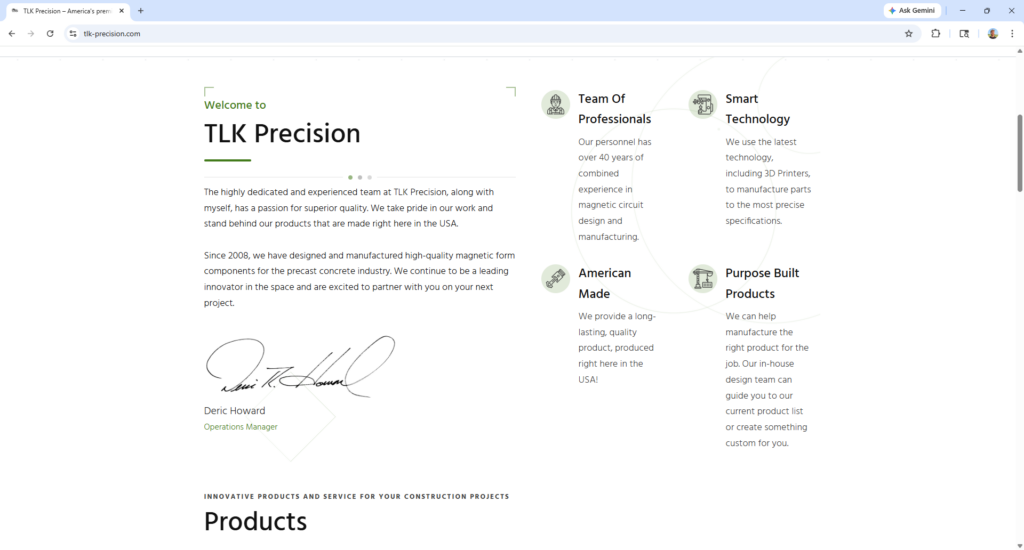
One of my first initiatives in improving TLK Precision’s website was refining the homepage to create a more cohesive design and better-organized content structure. Key sections updated included the welcome section, product grid, and distributor area.
I focused on consistency, spacing, readability, and clearer visual hierarchy so the page felt more intentional across both desktop and mobile.
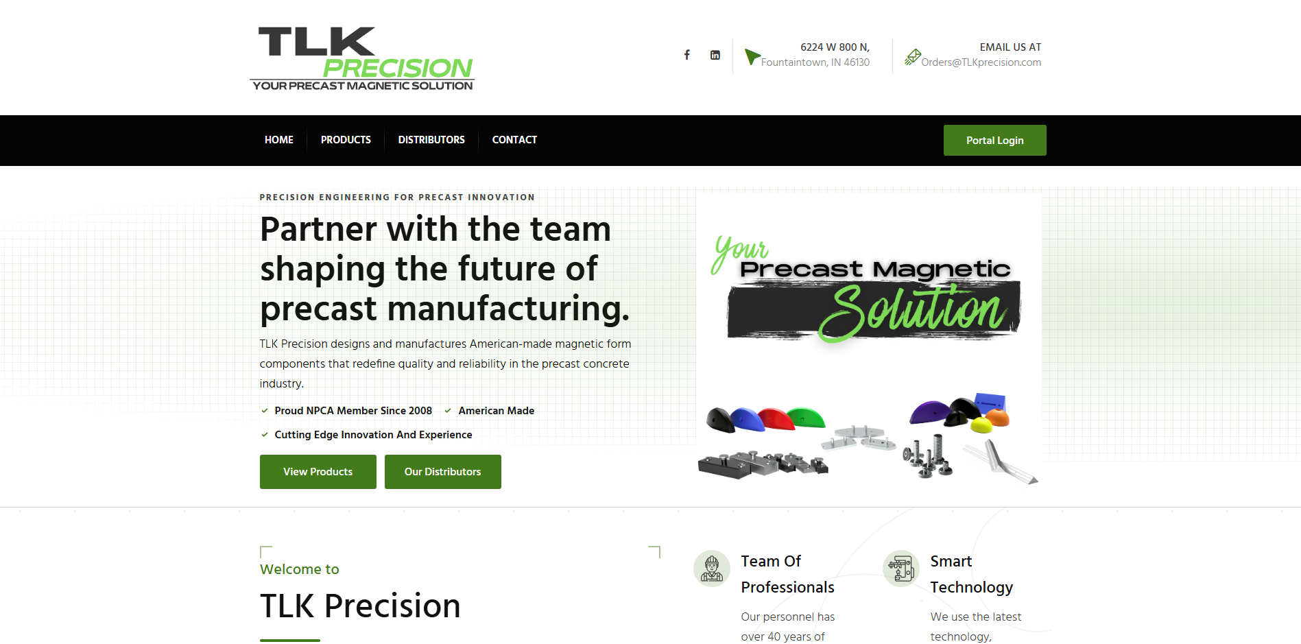
Hero Section
Original module
The hero relied heavily on imagery without clearly communicating value.
Desktop before
Mobile before
Updated module
The improved hero introduces clearer messaging, stronger hierarchy, and a more brand-aligned visual presentation.
Desktop after

Mobile after
A subtle draft-paper-inspired background was used to better reflect TLK Precision’s engineering focus.
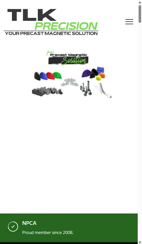
Home Page Content Organization
Original module
The earlier layout felt less structured across desktop and mobile, with weaker visual consistency between sections.
Desktop before
Mobile before
Updated module
The refreshed layout has a cleaner structure and improved readability across breakpoints.
Desktop after

Mobile after
Mobile after / navigation update demo
I fixed horizontal overflow and usability issues in the mobile navigation without changing the original design. The sub-navigation was causing unintended horizontal scrolling and obscuring links on smaller screens. The code below demonstrates the approach used.
html, body {
  overflow-x: hidden;
}

body.open-canvas-panel {
  overflow: hidden;
}
I also standardized full-width and wide-aligned elements to keep alignment cleaner across breakpoints.
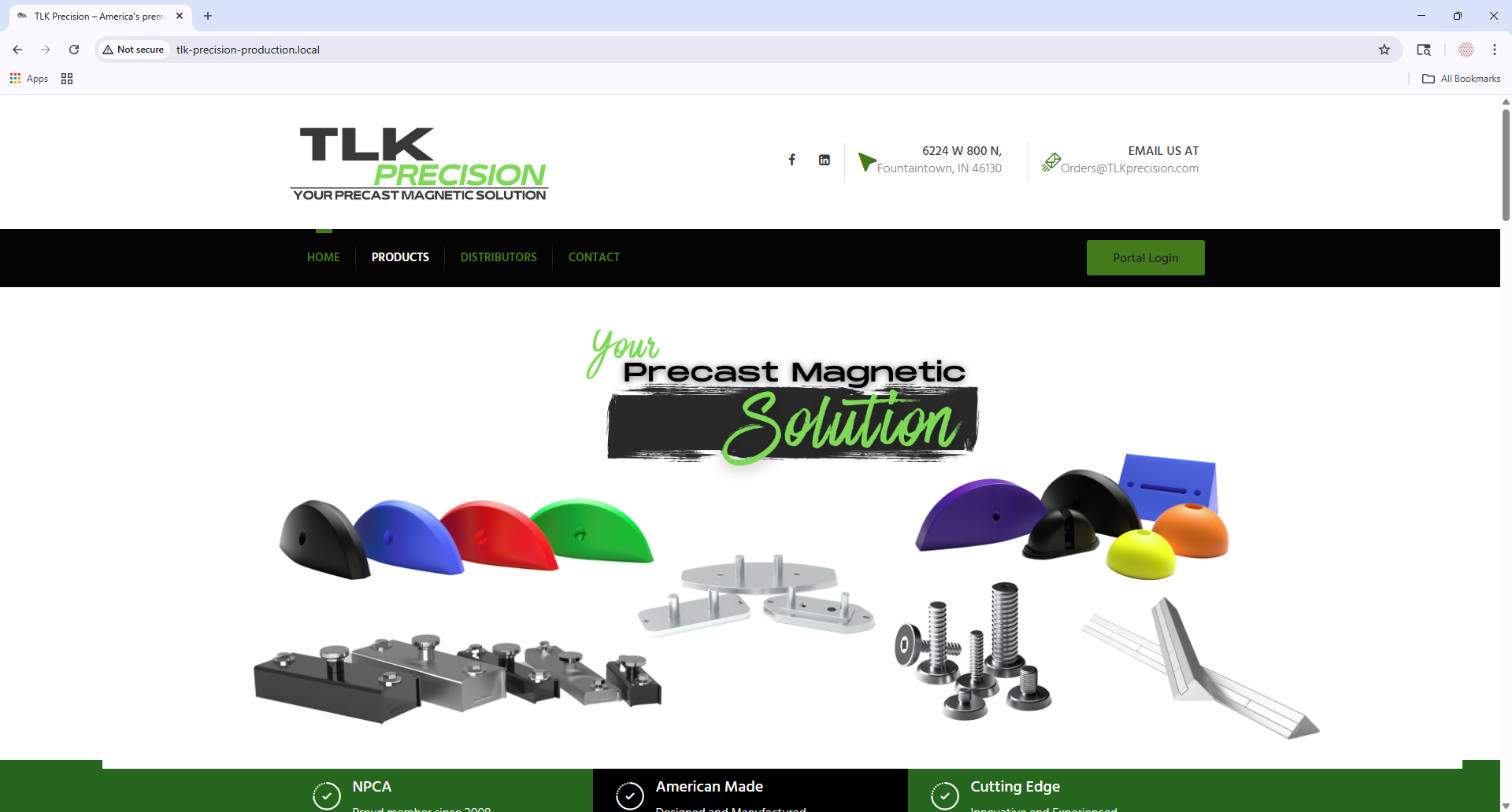
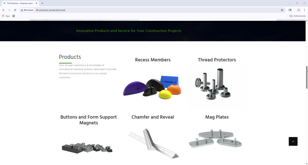
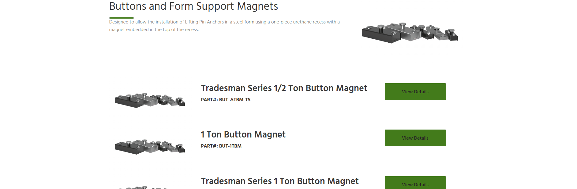
Product Area
Original module
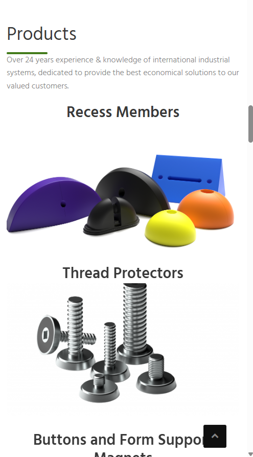
The product-focused areas felt more crowded visually and did not feel as polished on smaller screens.
Desktop before
Mobile before
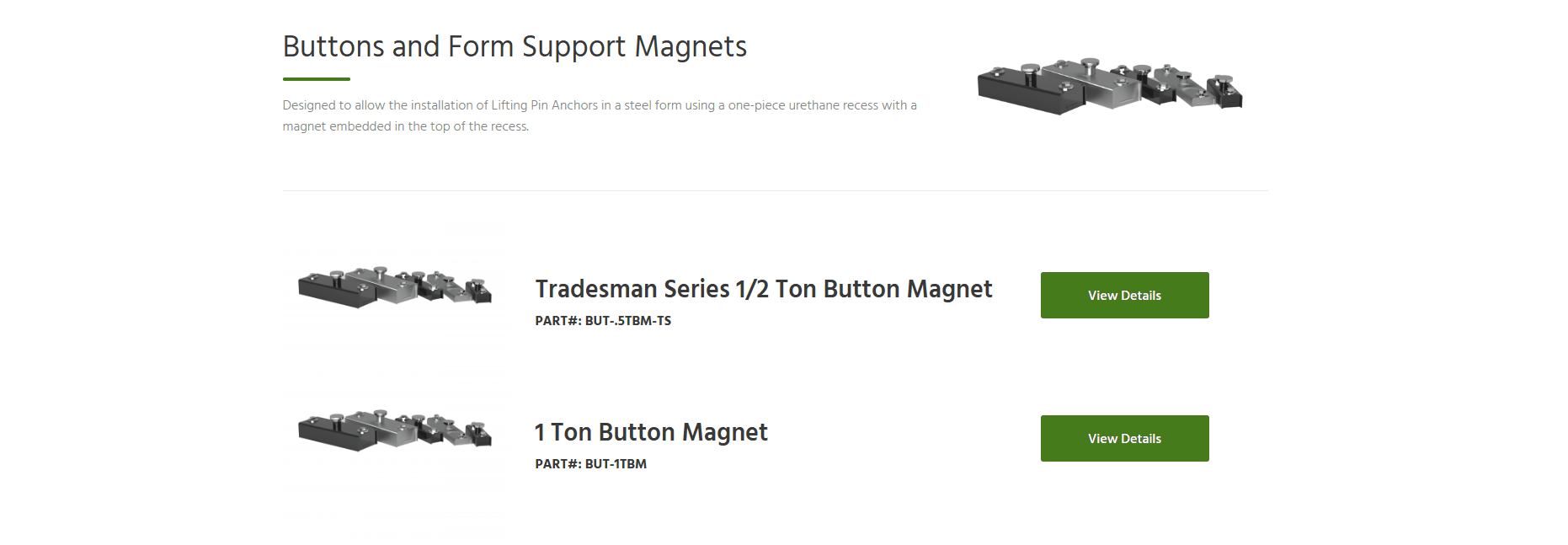
Updated module
The updated layout improved spacing, made the section easier to scan, and created a more refined presentation across devices.
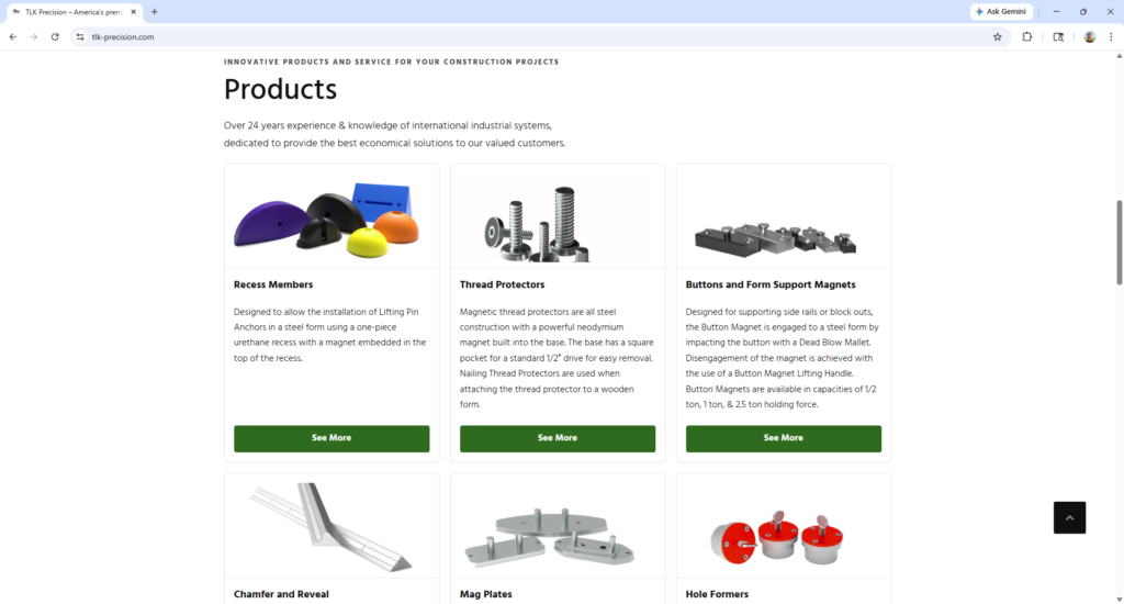
Desktop after
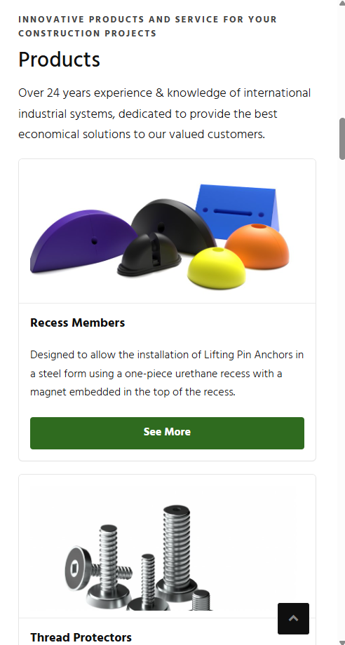
Mobile after
Distributor list
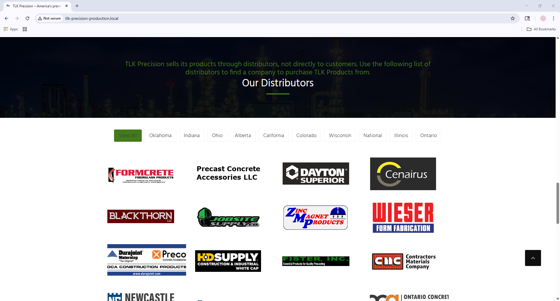
Original module
The heading placement and color combination of dark colors against each other as well as image sizing were all areas for improvement.
Desktop before
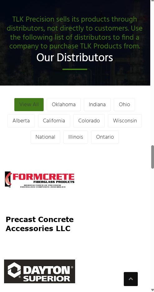
Mobile before
Updated module
The updated section has improved color contrast, consistent spacing, and proper markup flow.
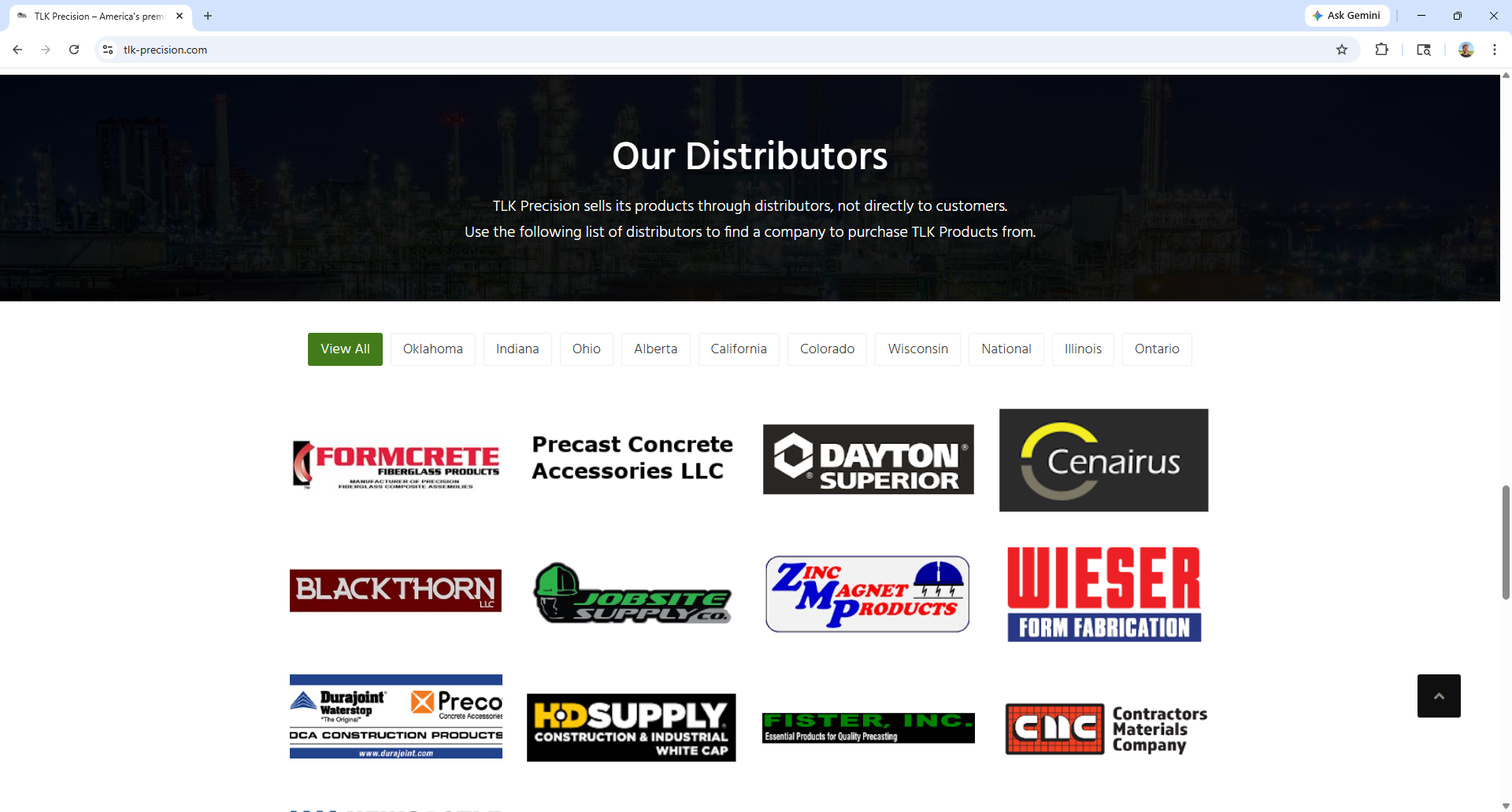
Desktop after

Mobile after
Product Linking Issue Solution
There was an issue on the website where product-related links were leading to 404 errors because they pointed to URLs that did not correspond to existing WordPress pages. Since these URLs followed a predictable SKU-based pattern, I implemented a dynamic solution that allowed those requests to resolve without manually creating individual pages for every part number (given the large quantity of parts sold).
Original problem
Before
Solution
After
Dynamic SKU Routing in WordPress
To resolve broken SKU-style links without creating hundreds of individual pages, I built a lightweight dynamic routing system directly in WordPress. The solution recognizes valid SKU requests, checks whether they relate to published site content, and then generates a virtual detail page on the fly.
Rewrite rule for SKU-style URLs
My approach started with a custom rewrite rule and template redirect flow in the theme’s functions.php file. This allowed WordPress to recognize SKU-style URLs and route them through custom logic instead of treating them as unresolved pages. Because the broken URLs followed a consistent alphanumeric format with hyphens, I used pattern matching to detect valid SKU requests and pass them into a custom query variable.
add_rewrite_rule(
    '^([A-Z0-9][A-Z0-9.-]*)/?$',
    'index.php?tlk_sku=$matches[1]',
    'top'
);
Validating the requested SKU against published content
From there, I added logic to verify that the requested SKU actually appeared in published site content before rendering anything. This prevented conflicts with real WordPress pages and ensured the dynamic page only appeared when the SKU was tied to an existing product line.
$page_id = $wpdb->get_var($wpdb->prepare(
    "SELECT ID FROM {$wpdb->posts}
     WHERE post_status = 'publish'
       AND post_type IN ('page', 'post')
       AND (post_content LIKE %s OR post_excerpt LIKE %s)
     LIMIT 1",
    '%' . $wpdb->esc_like($sku) . '%',
    '%' . $wpdb->esc_like($sku) . '%'
));
Rendering a virtual SKU detail page
If a match was found, the site generated a virtual SKU detail page on the fly. Rather than storing hundreds of low-maintenance pages in WordPress, this approach rendered the SKU, connected it back to the appropriate product category, and gave users a clear path to continue browsing or contact the company for specifications, pricing, and availability.
<h1 class="display-4 fw-bold text-success"><?php echo esc_html($sku); ?></h1>
<p class="card-text">
    This part is part of our
    <a href="<?php echo esc_url(get_permalink($parent)); ?>" class="text-success fw-bold">
        <?php echo esc_html(get_the_title($parent)); ?>
    </a> product line.
</p>
Why this approach worked well
This was a practical fit for the site’s needs because the part numbers were referenced in a predictable way and did not require fully managed product-detail pages with unique descriptions. It resolved the broken-link issue, improved the user experience, and avoided unnecessary content maintenance.
Future scalability
If the site’s needs grow in the future, this approach could later evolve into a custom post type or a more fully structured product catalog.